As a professional interior designer, I’ve seen the inside of many residences–large and small, modest and luxurious, rustic and polished–but they all have some of the same decorating dilemmas in common. I always have to smile when a potential client says, “Don’t look at my house! I’m embarrassed by my decorating skills.” To which I reply, “Well, if it was perfect, then you wouldn’t need me, now would you?” I’m certainly glad that everyone is not an expert designer, otherwise I wouldn’t be employed.
I think that many people automatically assume that a designer is taking a mental tally of design mistakes while they evaluate a new client’s home, along with subconsciously performing a white glove test. Wow…that’s a lot of pressure for a new client! But, you can relax, because the truth is that we really aren’t that critical. Whew! Thank goodness, right? We probably are taking stock of what’s working and what isn’t, what style the client prefers and which additional pieces would help to round out a room. That’s our job, after all. So, I decided to blog about the most common reoccurring design mistakes that I’ve noticed over the past thirteen years, because they really are pretty universal.
- Artwork that’s too small. I would say that incorrect scale is BY FAR the most common design problem that I encounter. Most often, I see artwork that is too small for a space. That doesn’t mean that bigger is ALWAYS better, either. It’s just as much of a problem to go too large with a piece of art. So, how do you determine the correct scale?

The artwork over this sofa is too small
The first thing to keep in mind is the size of the wall where the art will hang. Second, consider the size of the object that most relates to the piece you are purchasing. For example, if you are purchasing a piece of artwork for the wall over your sofa, you should measure both the empty wall space above the sofa and the length of the sofa. If the sofa is 80″ long, a good rule of thumb is to find a piece of artwork that is approximately 75% as long as the sofa or larger (up to the same width of the sofa). In this case, that would be about 60″ long minimum and up to 80″ long maximum. The artwork should hang a few inches above the back of the sofa and should take up approximately 75% to 85% of the wall’s height behind the sofa. Therefore, if the ceiling is 96″ and the height of the sofa back is 36″, there are 60″ left of open space to hang the art. That means that the artwork should be somewhere between 45″ and 51″ tall. This is only a loose formula, and there are always going to be exceptions (such as vaulted or cathedral ceilings), but this is a good general rule of thumb.
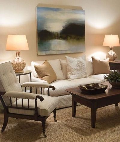
The artwork above the sofa is the correct scale
So, what if you have the perfect piece of artwork that is 48″ x 48″ that you want to hang over the sofa? It’s too small, right? No, not at all. Simply hang a sconce on each side of the artwork, or another pair of objects to fill the additional space. Just don’t get too cluttered with lots of very small pieces. A collection of medium sized art pieces can work, as well, like the one below.

Multiple pieces of art add interest and fill the negative wall space nicely
- Area Rugs that are too small. One of the most common design problems that I notice are area rugs that are too small. If the only piece of furniture touching your area rug is your cocktail table or ottoman, it’s much too small. You’ve probably heard the saying that, “No man is an island”. Well, I like to say that “no rug is an island” either. If your rug is acting like a place mat under only your cocktail table, it’s time to go bigger. As a general rule of thumb, I like for the front legs of the sofa and the front legs of side chairs to anchor the area rug.

This rug is much too small
However, if all of the legs of the sofa and chairs are sitting on top of the rug, then it’s possible that it’s too big. The exception to this rule is dining tables and chairs. It’s preferable for all legs of a dining table and chairs to sit on an area rug. One reason that clients are sometimes tempted to skimp on the size of large area rugs is that they are expensive! My solution for a large rug on a small budget is to select something cost effective like a solid color shag carpet or a smartly woven sisal rug. You can always save up for the luxurious hand knotted rug that you’ve been dreaming of and let the correctly sized solid rug stand in as a substitute in the mean time.

This rug is the correct size
- Paint colors that are too loud. Have you ever walked into a room where the walls were school bus yellow or screaming orange? Most likely, you wanted to turn around and walk right back out. People are inherently drawn to calming or happy spaces, but paint colors that are too saturated can be jarring. Paint colors set the entire tone for any room, but it can be so difficult for the average person to select one without a trained eye. So, what’s a girl or guy to do with so many thousands of choices?! If you desire a “color” rather than a neutral, don’t select it from the front third of the paint deck. Paint fans are typically arranged from the most saturated or pure colors at the front of the deck to the most muted colors toward the back of the deck (as a general rule, some paint brands may vary). Therefore, the yellows at the front of the deck will not have any gray added and are extremely pure pigment. In other words, they will be screaming yellow. A pure yellow swatch may look very happy in a 2″ x 2″ size, but a 10′ x 12′ wall of this color will make your head hurt! It’s much easier to live with more muted colors on a daily basis. Remember, colors tend to be brighter and a shade darker when applied to an entire wall. Therefore, when in doubt, select a color that is more muted (grayed out) and purchase a trial 6oz. jar to test on a piece of poster board before painting your entire wall.

Paint colors can be jarring if they are a pure pigment that is not muted
- “Beige” paint that looks pink. Another design dilemma that I often encounter is “beige” walls that actually look pink. This is an extremely common problem. Once a potential paint color has been selected for your room, my best tip to avoid the “pink disaster” is to carefully study the entire paint strip for this family of colors, not just the loose 2″ x 2″ swatch. Are there any pink or peach undertones in the strip of colors at all? If it’s slightly pink or peach anywhere on the strip, then your color will have pink or peach undertones, as well. Look at the paint strip in your room during the morning hours, mid day hours, afternoon and evening hours. The colors will change as the light exposure changes in your room. It may take a little patience and time to select a great paint color for your space, but it’s definitely better than having to repaint!

Oops…was this wall supposed to be beige?
Another way to easily check for pink undertones in a swatch is to put the paint strip next to a milk chocolate candy bar or coffee grounds. These colors are “pure” browns. Now, do you see any pink tones in your paint strip? Finally, as I mentioned previously, you can always purchase a 6oz. trial size of paint and paint a piece of poster board before painting your entire room. Check out the idea book called “Paint Colors” on my Houzz profile to view some of my favorites.

These neutral colors from Benjamin Moore are tried and true. No pink here!
- Draperies that are too short or draperies that are hung incorrectly. One of my biggest pet peeves is draperies that are too short. If your long drapery panels are more than 1/4″ above your floor, they are too short. You don’t want to look like your draperies have rolled up their pants legs to prepare for a flood!

These drapery panels are much too short
You want for them to look like they are lightly skimming the floor, much like a lovely couture gown. In my personal design opinion, the days of pooling drapery panels on the floor are over. Goodbye 1990! The neat and tailored look of panels barely touching the floor or 1/4″ above the floor is a much more updated and desirable aesthetic.

Drapery that is too long looks messy and not tailored
Another common design problem are drapery rods that are placed just above the window casing. This is too low. For the most appealing result, hang your drapery rod about 3″ below your ceiling line (or below your crown molding). This visually elongates the window and draws your eye upward, rather than stopping the eye abruptly at the top of the window casing.

This window treatment is hung correctly and has the perfect amount of fullness (double widths of fabric for each panel).
It’s also important to extend the drapery rod 8″ to 13″ on either side of the window, whenever possible. This gives your window a greater fullness and adds width and softness. When the drapery rod is too short and doesn’t extend past the window casing, the drapery panels hang over the window panes and block out the natural light. This makes your window appear much smaller than it actually is. The diagram below shows the dramatic difference between hanging your draperies correctly and incorrectly.

This diagram from Geranium Homes illustrates the dramatic difference in hanging drapery correctly versus incorrectly.
With a little attention to detail, any home can transform from an awkward duckling into a swan. Remember that paying close attention to scale and color can dramatically impact your room. So, pull out those paint strips, roll out a larger rug, raise up those drapery rods and prepare to take on your next design dilemma! You are one step closer to the room of your dreams.

This was very good information that I plan on using. Enjoyed the article.
LikeLiked by 1 person
This was good information that I plan on using. Enjoyed the article.
LikeLiked by 1 person
Very helpful and current decorating tips, thank you!
LikeLike
Thank you so much, Christy! There’s more to come soon.
LikeLike